Affinity Photo : Blend Ranges Tutorial
Part 4
Let's take a look at controlling Orange and Teal with Blend Ranges.
Open a photo.
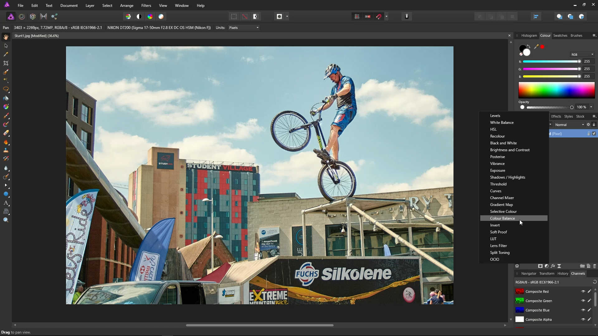
Click the Adjustments icon, and then select Colour Balance.
![]()
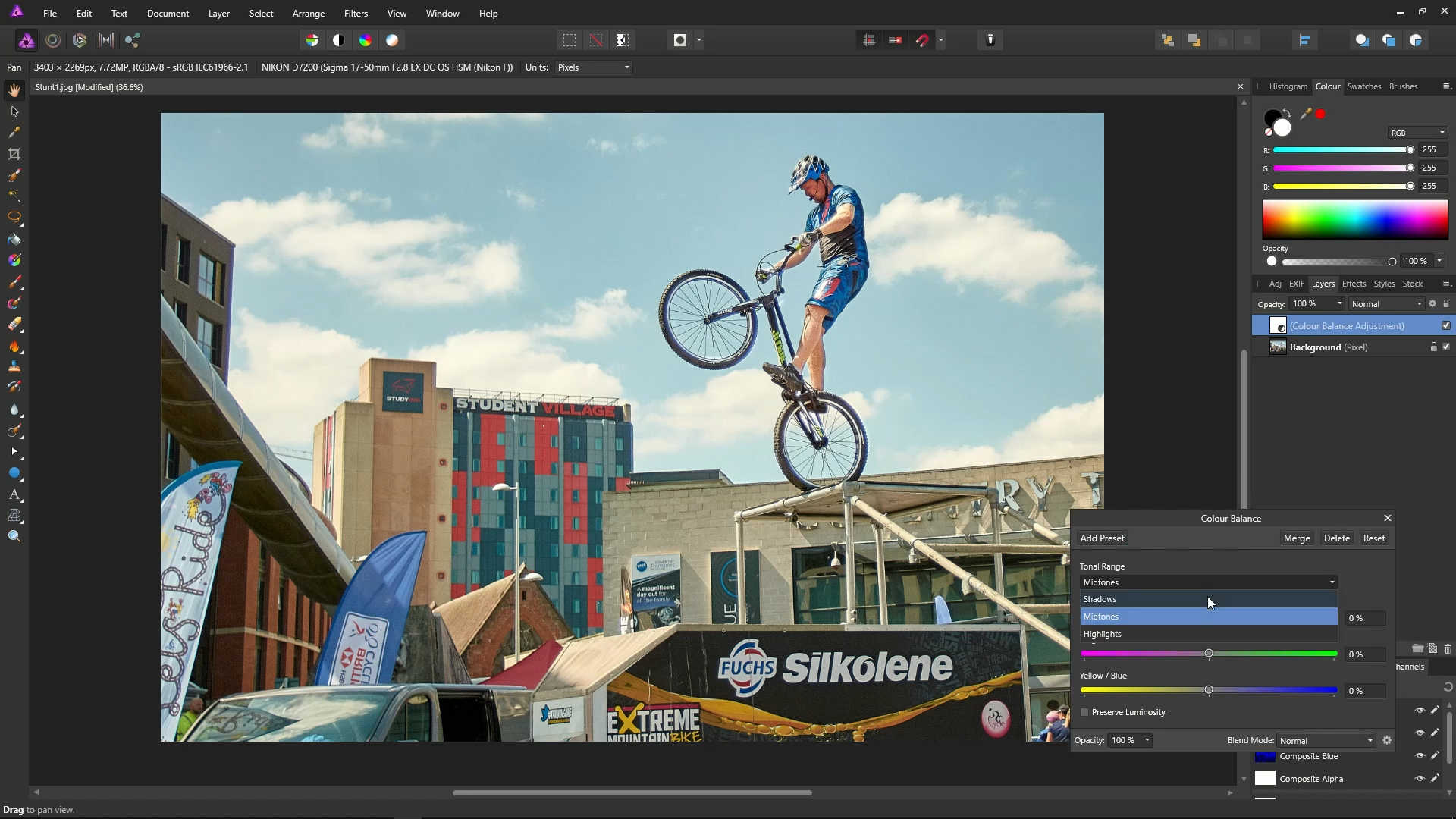
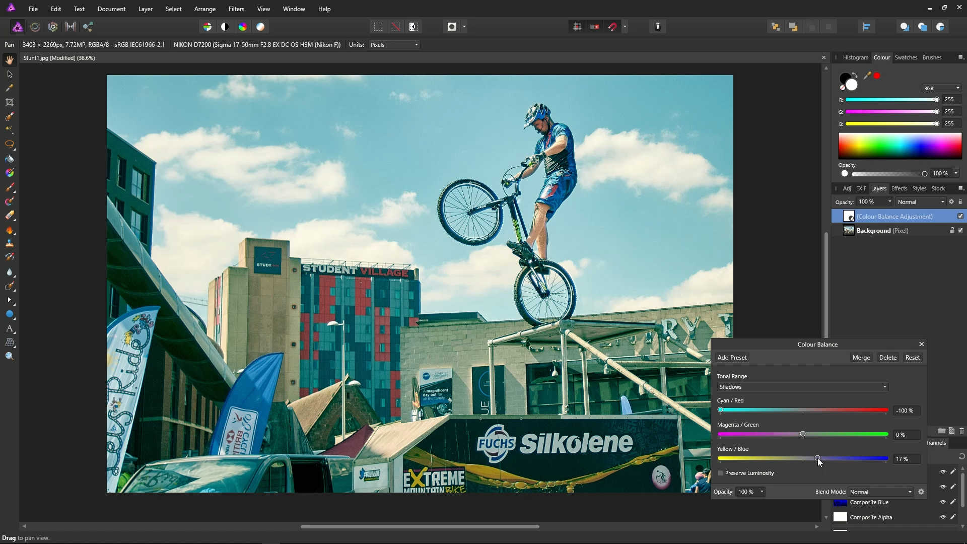
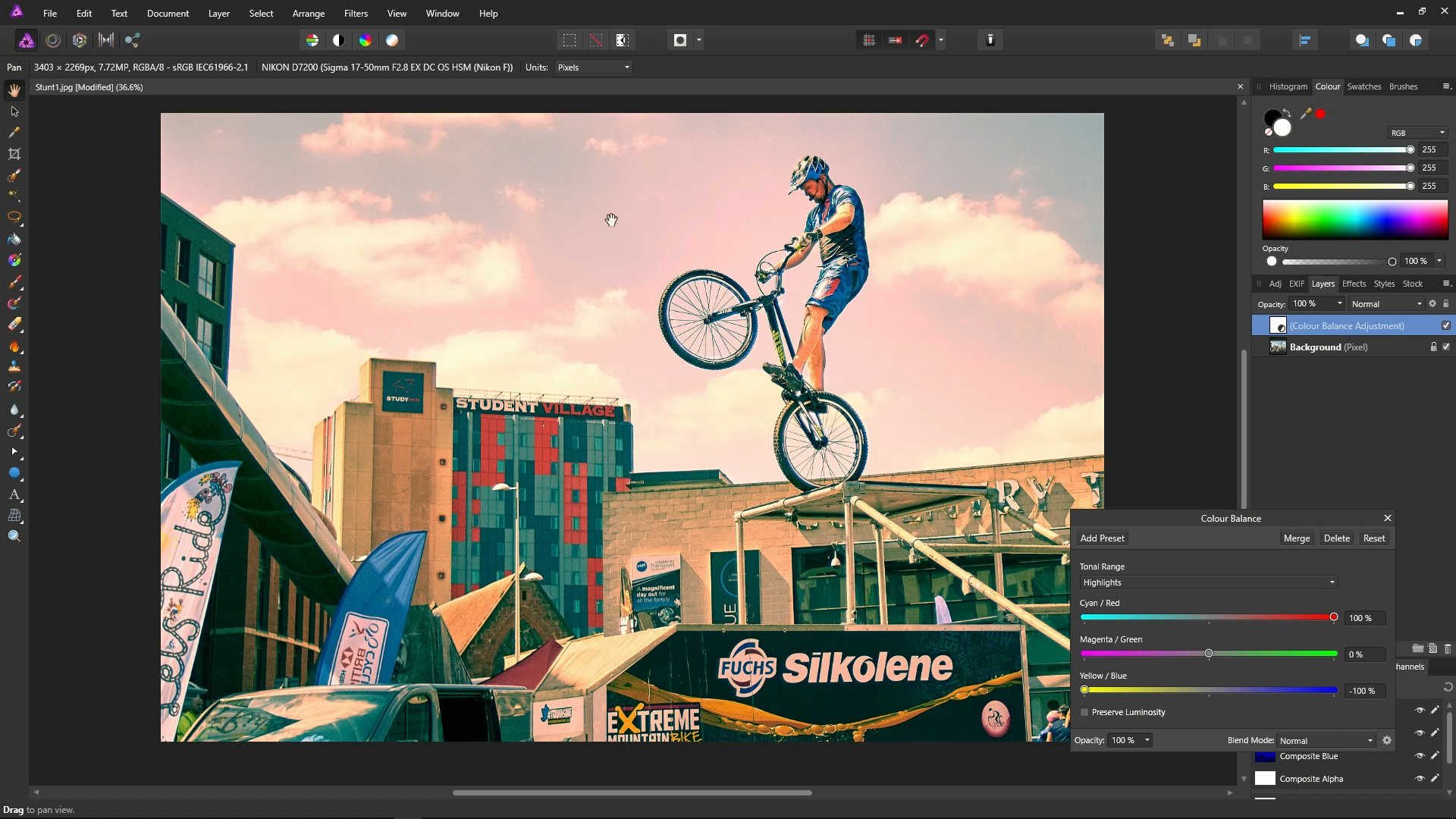
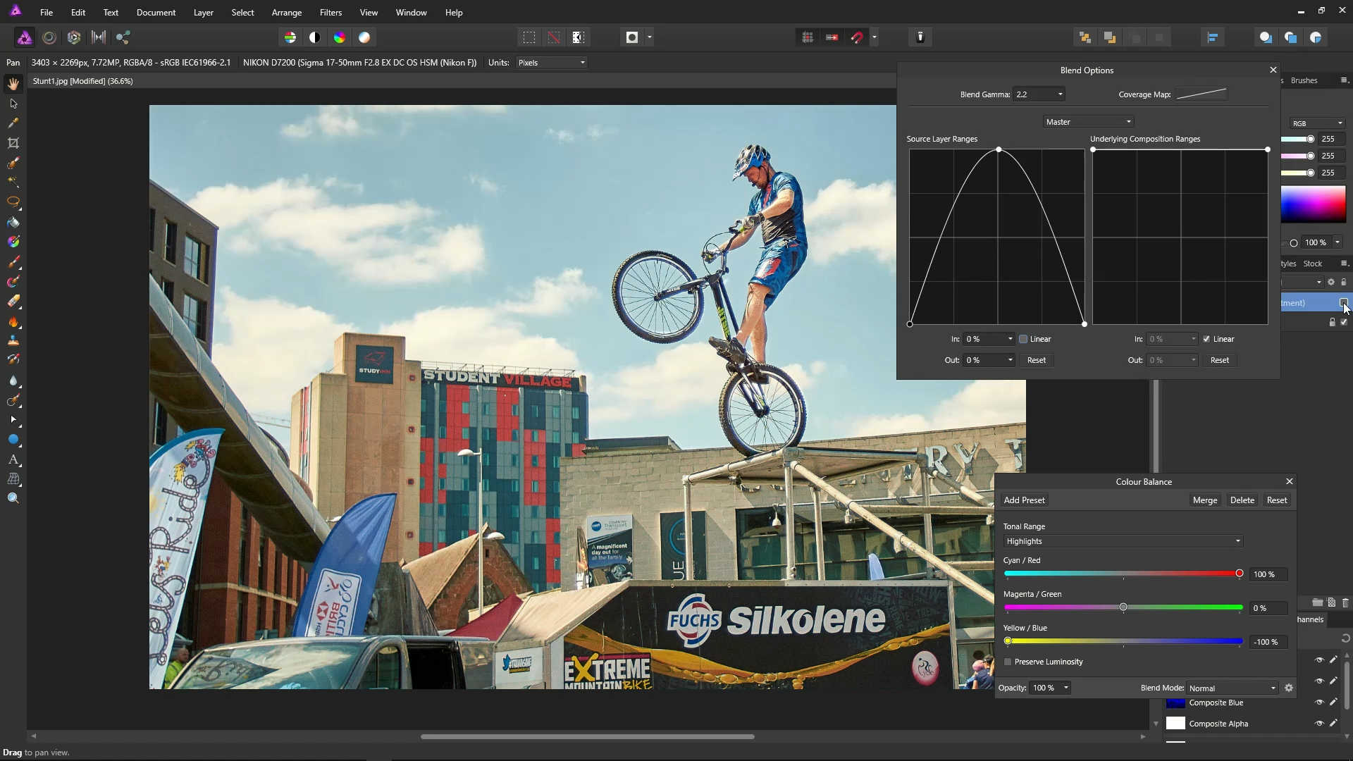
On the Colour Balance dialog, select Shadows from the dropdown menu.
Using the sliders, set Cyan/Red to -100%, and set Yellow/Blue to about 17%. This will give the shadows a teal colour.
Select Highlights from the dropdown menu.
Using the sliders, set Cyan/Red to 100%, and Yellow/Blue to -100%. This will give the highlights an orange colour.
The photo now has an "orange and teal" look, but it's far too strong. Let's see what we can do about this using blend ranges.
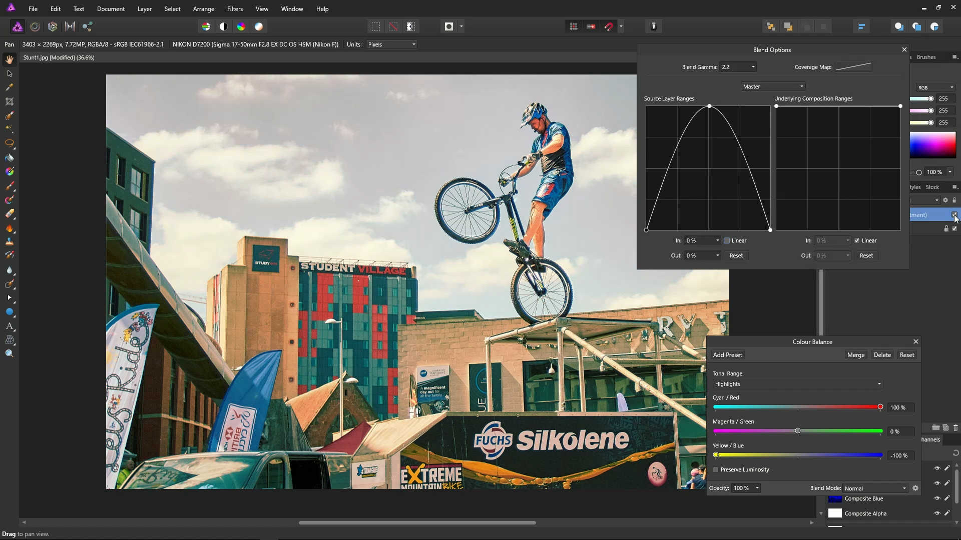
Open up the Blend Options dialog with the little cog.
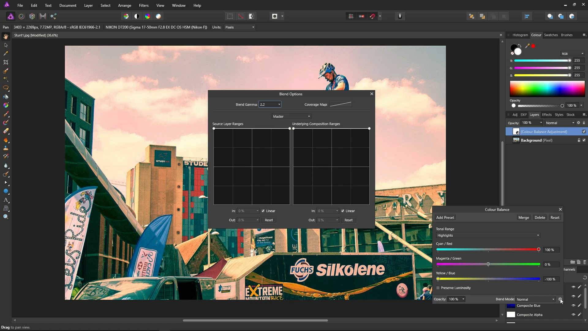
On the graph, place a point in the middle of the line, then bring down the highlights and shadows points (the left and right points) all the way to the bottom.
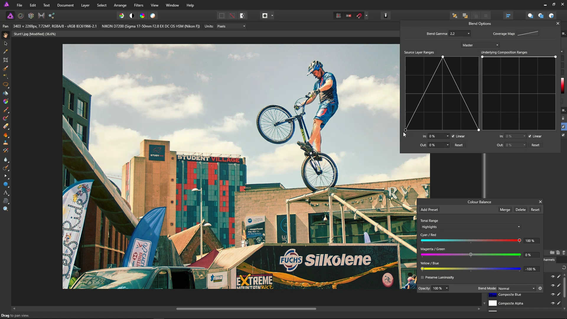
The effect will now be reduced in the very light and very dark areas.
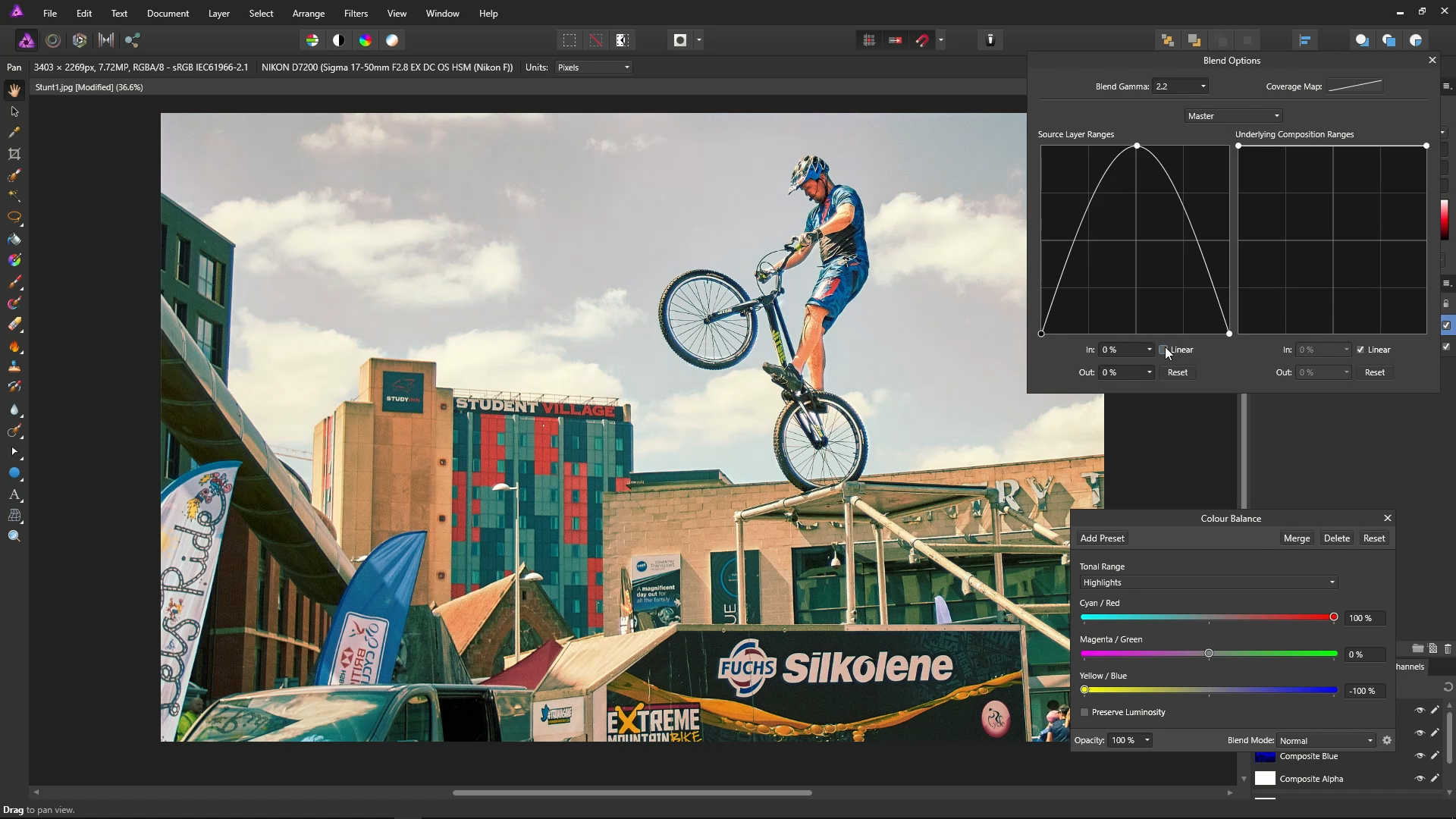
Untick the Linear checkbox to make the effect more smooth. The effect will now be more evenly spread.
You can use the checkbox next to this layer to toggle the orange and teal effect off and on.
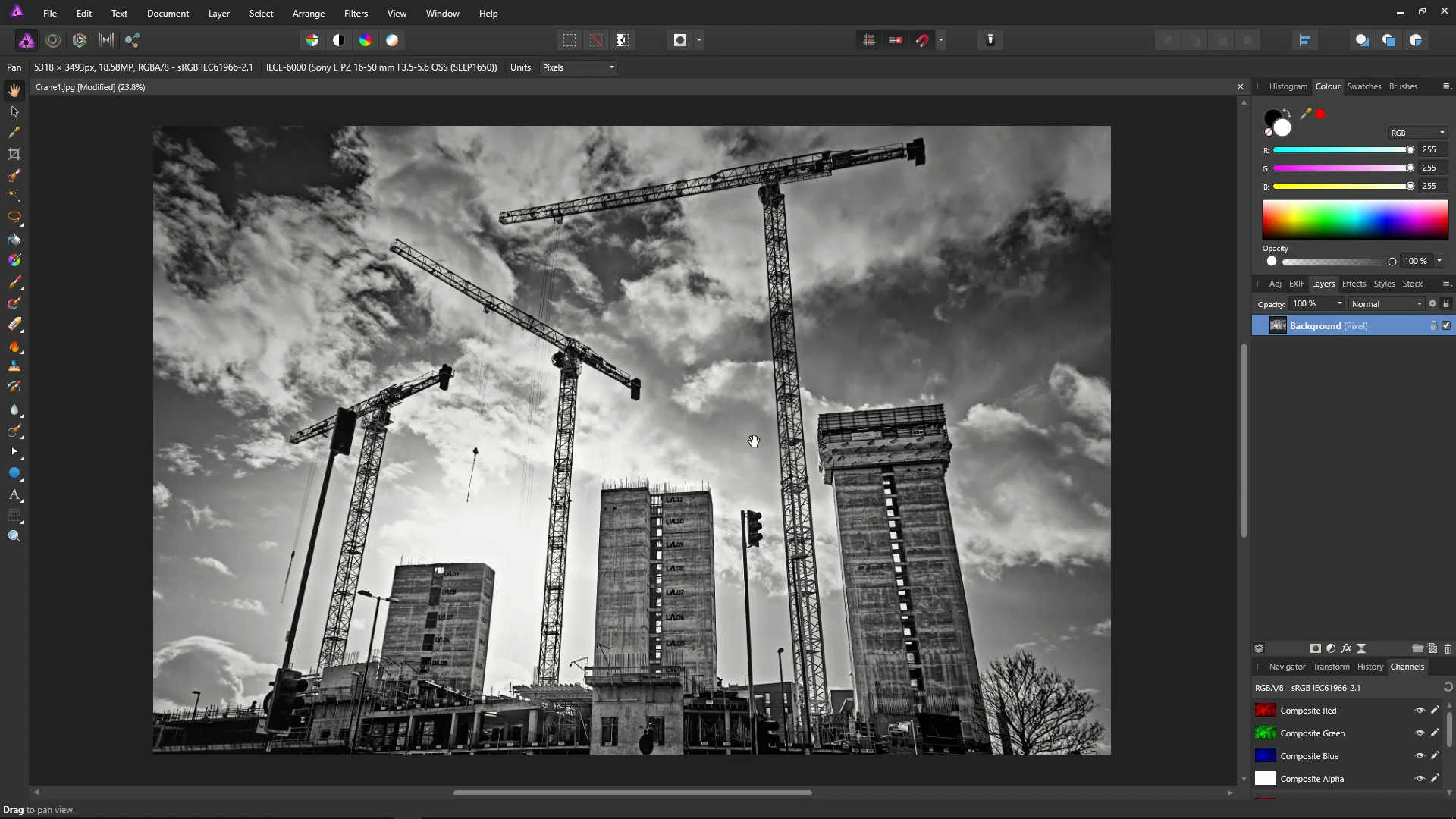
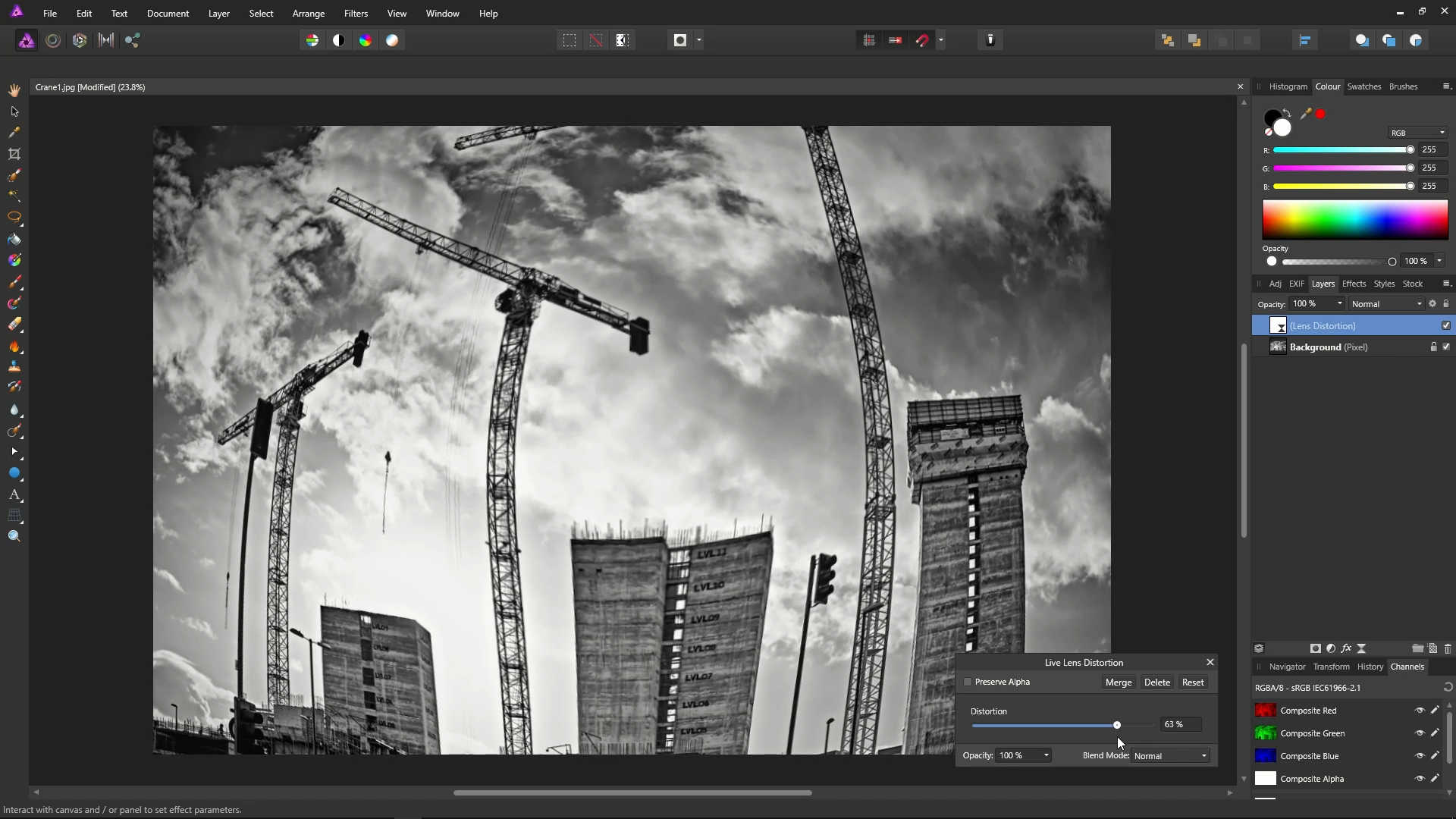
Now, let's try something completely different and bonkers! You'll probably never do this in the real world, but it's worth doing this just for a bit if fun!
Open a photo.
Click the Live Filters icon, and select Lens Distortion Filter.
![]()
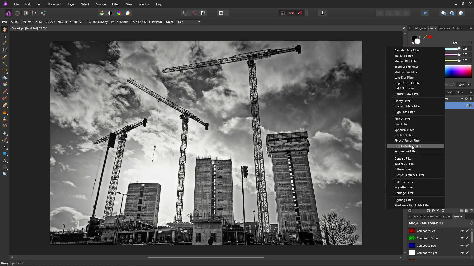
Using the Slider, set the distortion to something that looks quite ridiculous. In the example, we've gone with 63%!
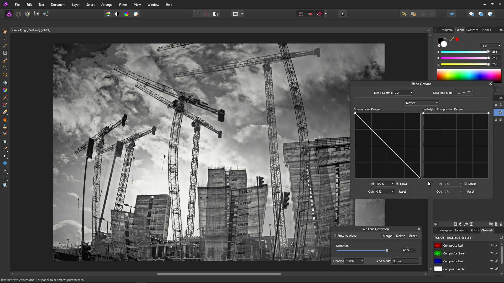
Click the Blend Ranges cog in the Layers panel.

Drag the second point to the bottom, and you'll get this bizarre effect!
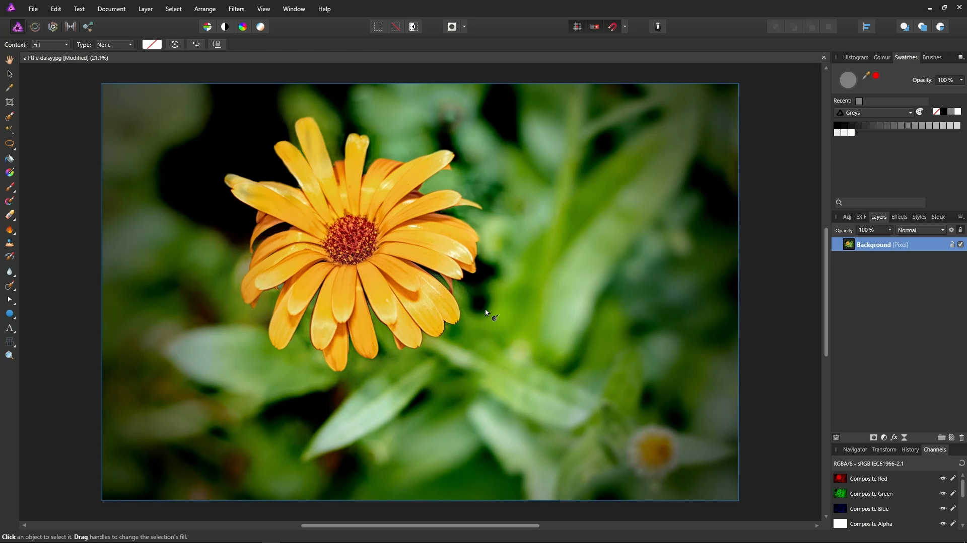
We're now going to take a look at what the right hand side graph on the Blend Ranges dialog does.
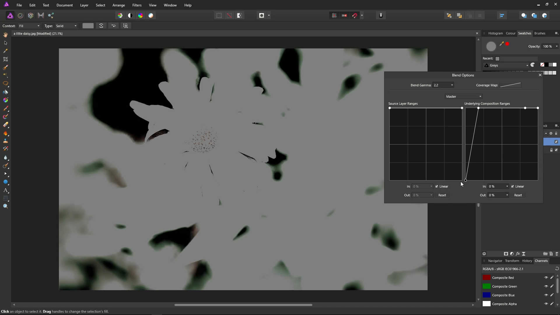
Open a photo.
On the Main Menu, select Layer, then New Fill Layer.
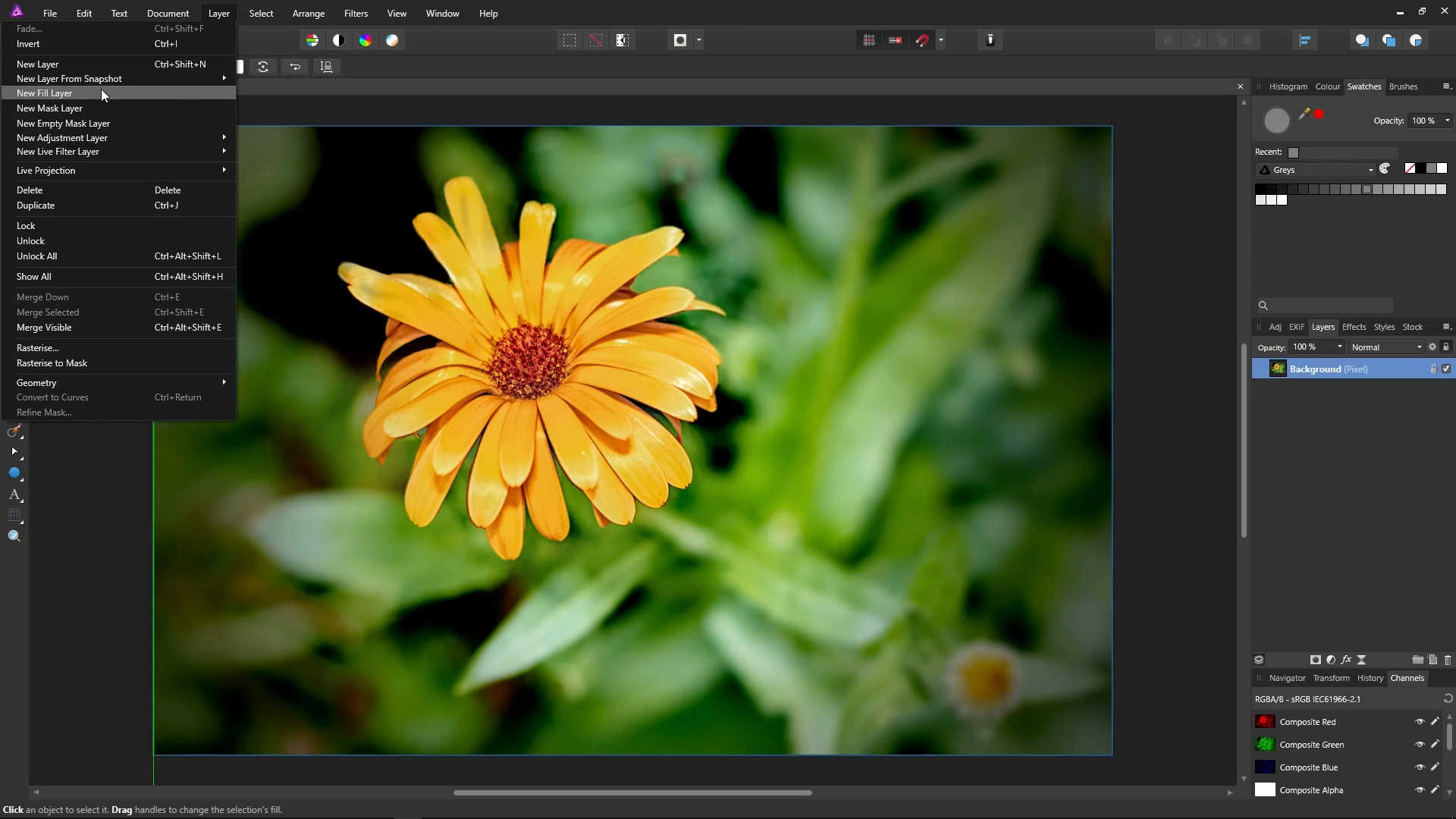
Make sure that it is filled 50% grey.
Open up the Blend Options dialog, and move it to the side so you can see your working area.
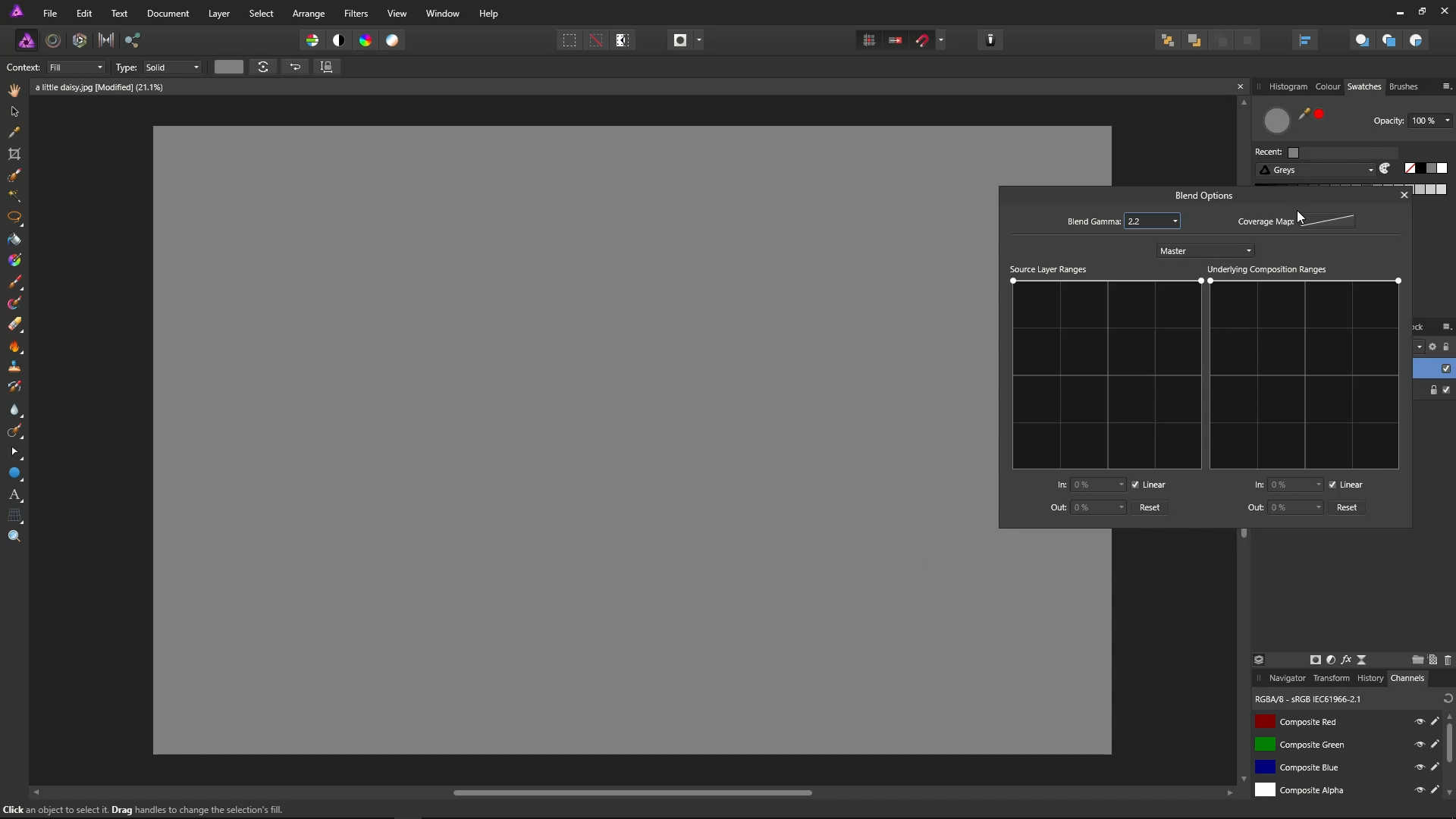
So, the graph on the right hand side of the Blend Options dialog doesn't control this layer's opacity. It controls what comes through from underneath.
Drag the point on the right (which represents white) to the bottom.
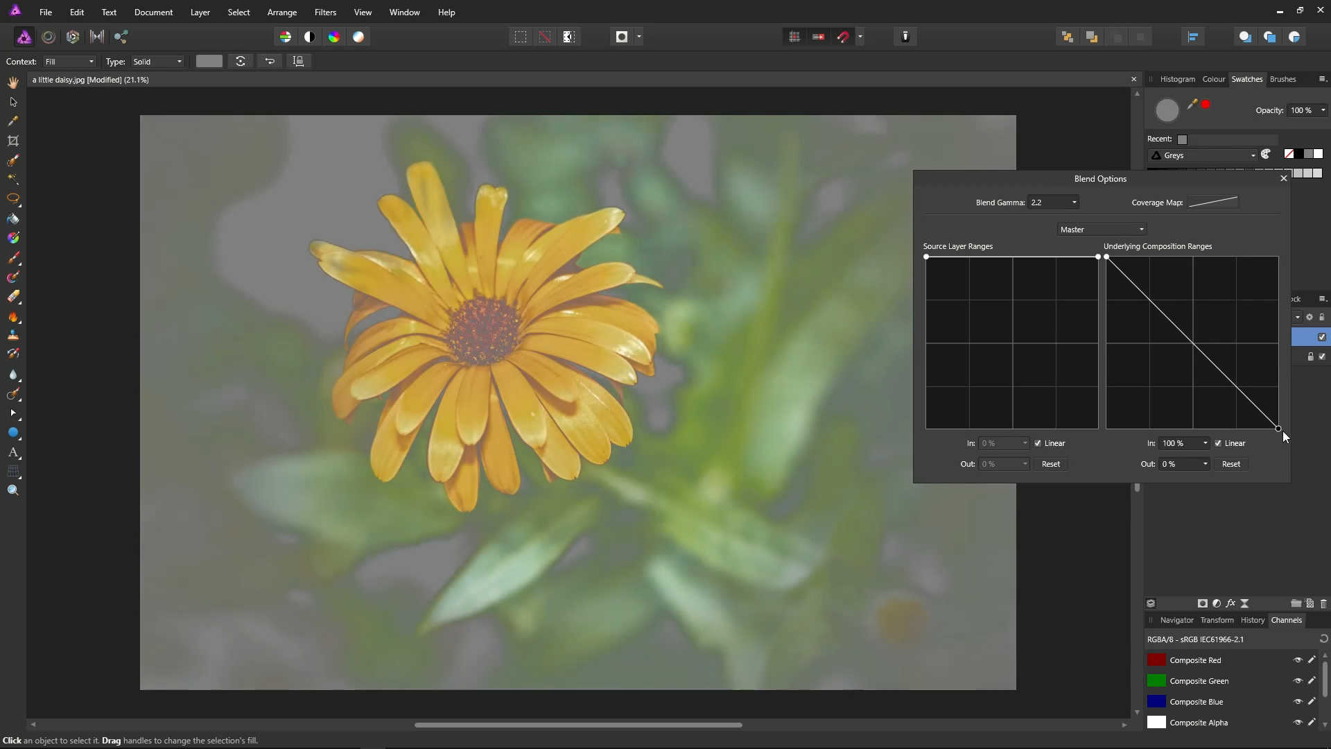
Create another point, and move it to about 80% of the way across, at the top.
Effectively, we have said here not to allow any of the colours between the first two point through from the layer below. As a result, we see the highlights of the petals, because they are very bright colours - in the range between the second two points.
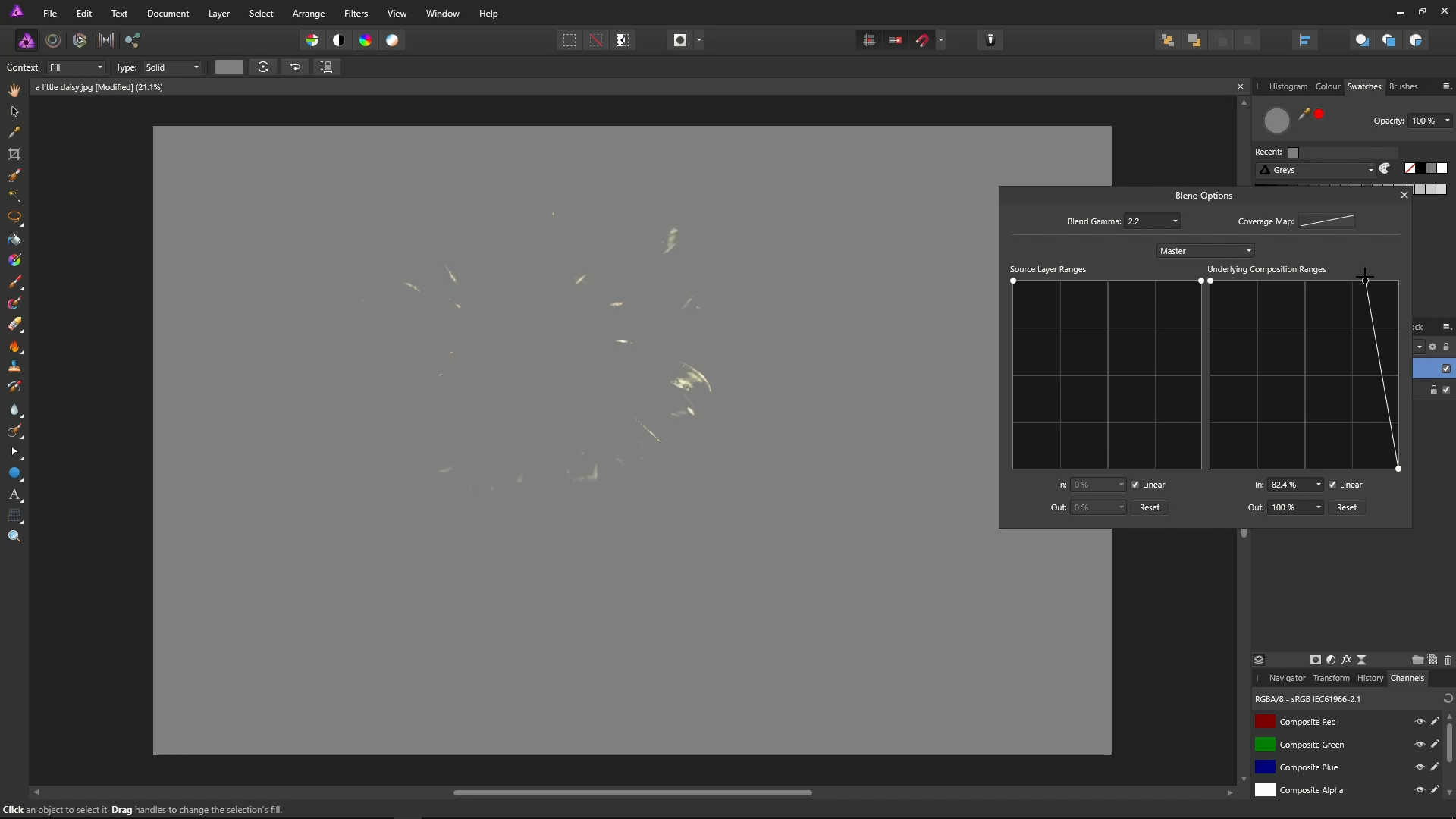
We can do the equivalent for the dark colours - just letting the darker colours through.
We can let only the mid-tone colours through by creating three points near the middle, and dragging the middle point to the bottom.
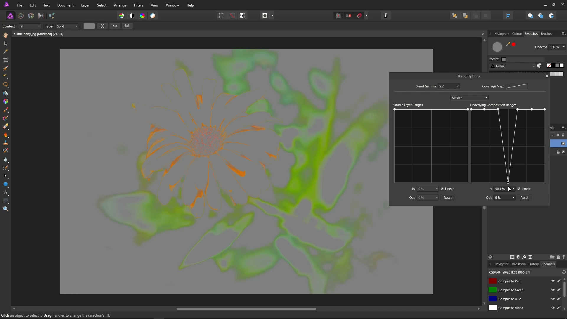
When a point is at the top of the graph, it is blocking, and when a point is at the bottom of the graph, we are allowing colours through, from the previous layer.