Affinity Photo : Blend Ranges Tutorial
Intro
How to use the blend range functionality in Affinity Photo.
Blend ranges are extremely versatile, allowing the user to target nearly all adjustments and filters to specific luminosity ranges.
Affinity Photo's blend ranges are a direct replacement for luminosity masks and "blend if" functionality in Photoshop. Blend ranges are a far more advanced, user friendly and elegant solution.
While following the tutorial, you can click on the images to view a larger version in a new window or tab.
You can also learn this technique by watching our YouTube video below, or directly on YouTube.
If you do watch on YouTube, please consider giving the video a Like, and Subscribing for more tutorials!
Tutorial
Before we look at real world examples, let's take a look at how blend ranges work.
Click File, New, and create a blank 2048x2048 image with a transparent background.
Create a new fill layer by selecting Layer from the main menu, then New Fill Layer.

Pick a colour. We've gone with green.

Click the Add Pixel Layer icon.
![]()
We're now going to create a top-to-bottom gradient. So, click the Gradient icon on the Tools menu.
![]()
Create a gradient from the top to the bottom, by dragging with the mouse.

We are now going to make the gradient white-to-black, from top top bottom. Click the top point on the gradient.
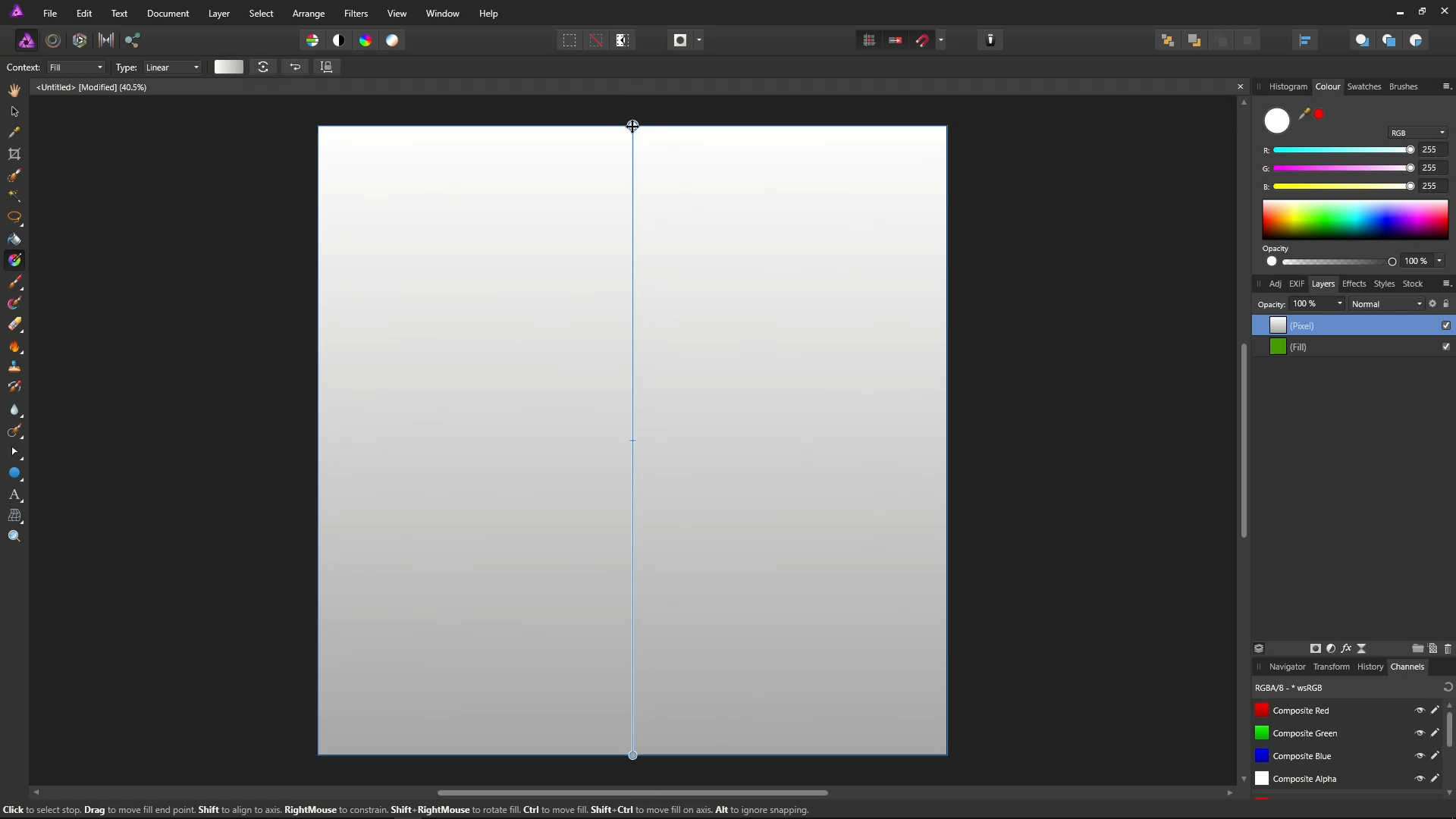
Select pure white in the colour picker.

Click the bottom point on the gradient, and select pure black in the colour picker. You should now have a top-to-bottom, white-to-black gradient.

Click the hand icon (View Tool) to get rid of the gradient controls.
![]()
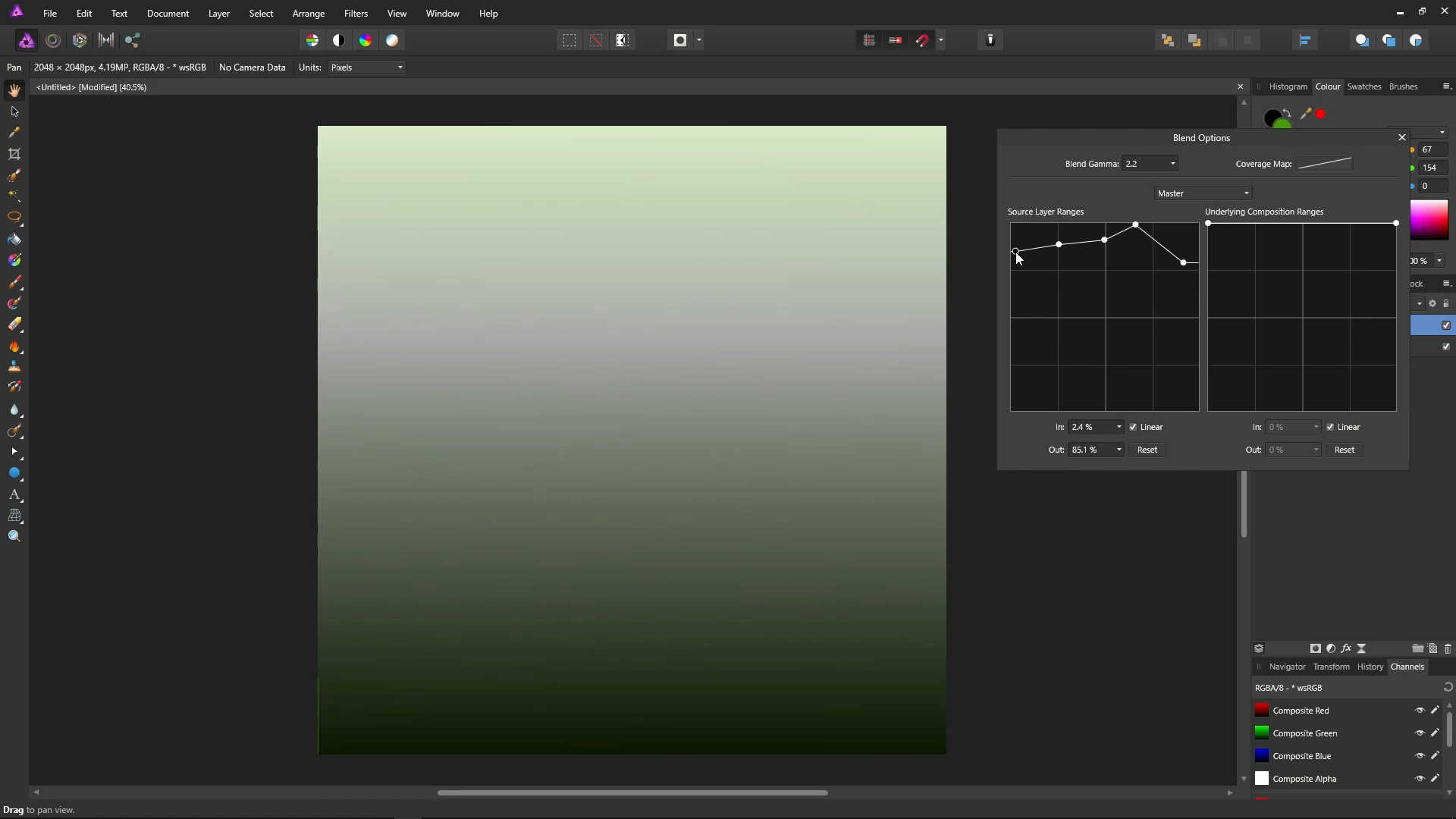
Now we're going to open up the blend ranges dialog and look at some examples. On the layers panel, make sure the Pixel Layer, which contains the gradient, is selected. Then click the Blend Ranges icon (the little grey cog) to bring up the Blend Options for this layer.
![]()
You can move the blend ranges dialog around by dragging it from its title bar. Move it to the side so you can see the image that we're working on.

For now we're going to look at the left hand graph, "Source Layer Ranges". Later, we'll also take a look at the right hand graph, "Underlying Composition Ranges".
On the Source Layer Ranges graph, the leftmost edge of the graph represents black, and the rightmost edge of the graph represents white.
The top of the graph represents 100% opaque (completely visible), and the bottom of the graph represent 0% opaque (completely invisible).
At the moment, there are two points in the graph, one at the top left, and one at the top right. This means that all colours will currently be completely visible.
We'll look at some examples in a moment, but for now let's take a look at adding/removing/moving points.
You can add points to the graph by left-clicking on the graph.

You can remove a point by right-clicking on it.

You can add as many points as you like.

You can move points by dragging them, including the first and last points.
You can use the Reset button below the graph to start over with the original top-left and top-right points.

Now, let's take a look at how the blend ranges work. Because the top-left point represents black at 100%, if we drag the left point downwards, black will become completely invisible, and the underlying green colour will start showing through the darker colours.


We now have a diagonal line in the graph. This line says at at the colours get more white, they become more opaque (visible).
- Black, which is at the very left of the graph, is completely invisible, meaning the green will show through 100% where there is black
- Grey, the middle of the graph is 50% visible, meaning the green will show through 50% where there is grey
- White, the very right of the graph, is completely visible, meaning the green will not show through at all where there is white
- And everything between
Move the left point back to the top-left, so we're back to the defaults. You could also do this with the Reset button.

If we drag the right point downward, white will become completely invisible, and the green will show through in the lighter colours.


- Black, which is at the very left of the graph, is completely visible, so we see it as 100% black
- Grey, the middle of the graph is 50% visible, meaning the green will show through 50% where there is grey
- White, the very right of the graph, is completely invisible, meaning the green will show through
- And everything between
Click the Reset button.
