Affinity Photo : Blend Ranges Tutorial
Part 2
Create a point in the centre.
The center point represents 50% grey. If we drag the center point to the bottom, grey will become completely invisible, while white and black will remain completely visible.


- Black is now 100% visible
- White is 100% visible
- 50% grey is now completely invisible, so we are seeing pure green show through
- And everything in between
Move the point to the center, vertically.
Now, in the vertical center of the image, the grey is 50% visible, and mixed 50% with the green.

Move the point so it is 25% of the way across, horizontally.
Now, 25% grey is 50% visible, black is completely visible, and white is completely visible.

Move the point to the bottom, keeping it at its current horizontal position.
Now, 25% grey is invisible, fully showing the green underneath. Black is completely visible, and white is completely visible.
Bring the first point down to the bottom to make black completely transparent. The green will now be completely showing between black and 25% grey.
Hopefully these examples give you an idea of how it works. We can also create more abrupt steps.
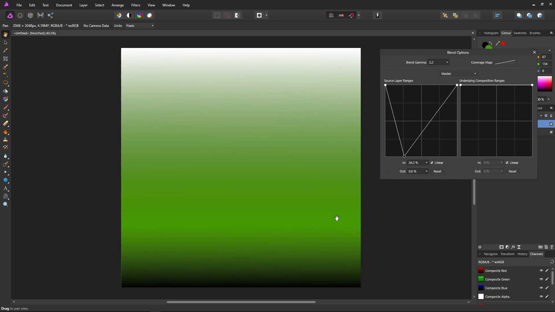
Bring the middle point up to the top.
Bring the first point across so it is just short of the second point.
Now, everything from black to 50% grey is completely transparent, so the green shows through. Everything from 50% grey is completely visible, so no green shows through.
We can also create curves, for a more smooth transition.
Create the line/points as shown in the following image. Remember, it is left-click to add a point, right-click to remove a point, and you can drag them to move them.
Untick the box that has Linear written next to it. This will make the curve smooth, which makes for a much nicer transition.

Click the Reset Button.
Let's try out the blend options functionality with some colour and a horizontal gradient.
Move the Blend Options dialog out of the way of the Layers panel.
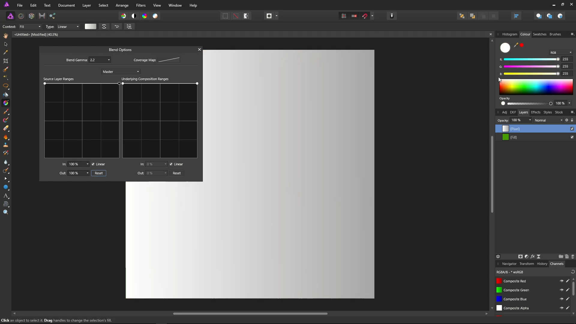
Make sure the pixel layer, which has the gradient on it, is selected, and delete it by pressing the Delete key. You should now be left with just the Fill layer.
![]()
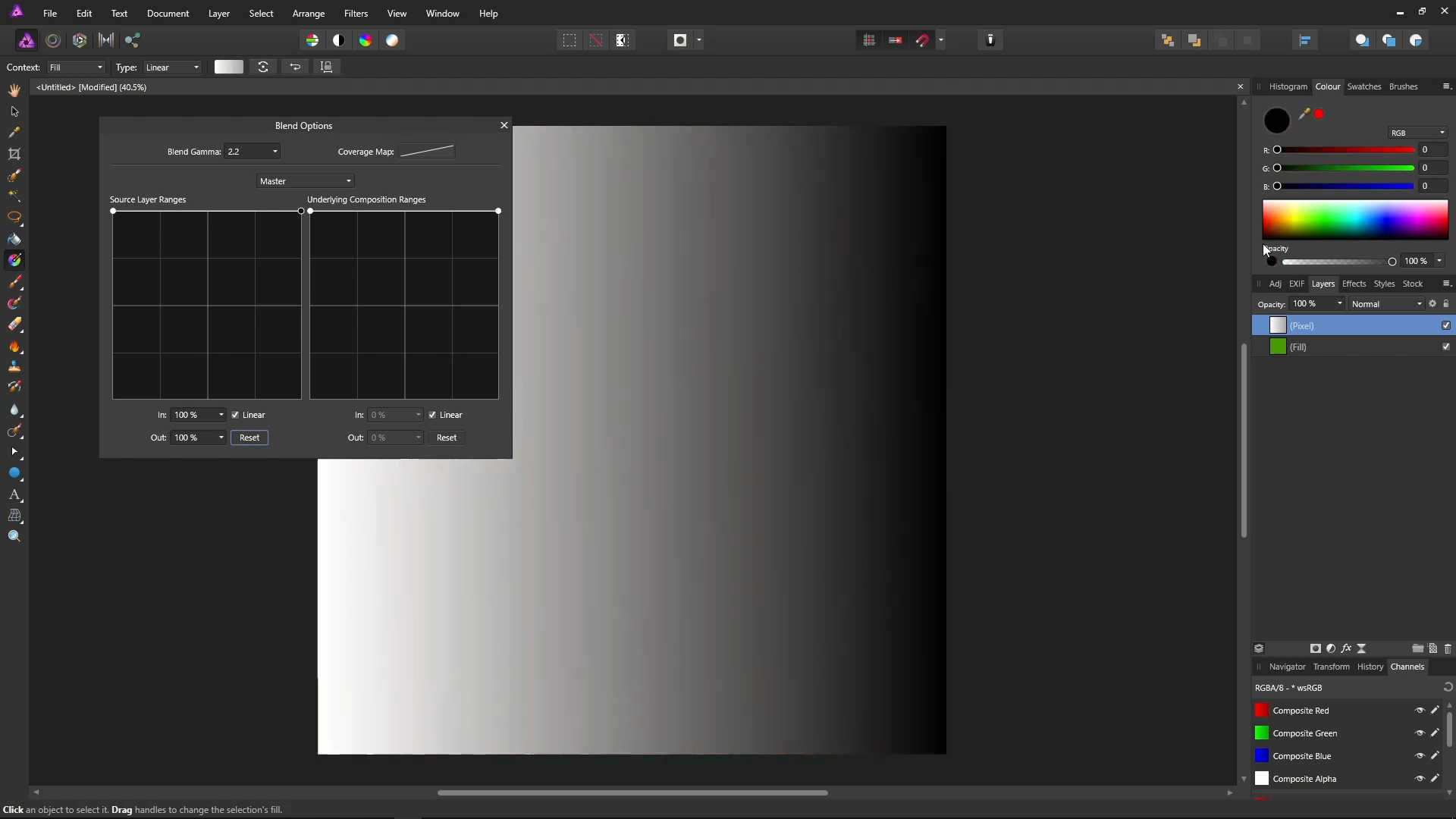
Add a new pixel layer by clicking the Add Pixel Layer icon below the layers panel.
![]()
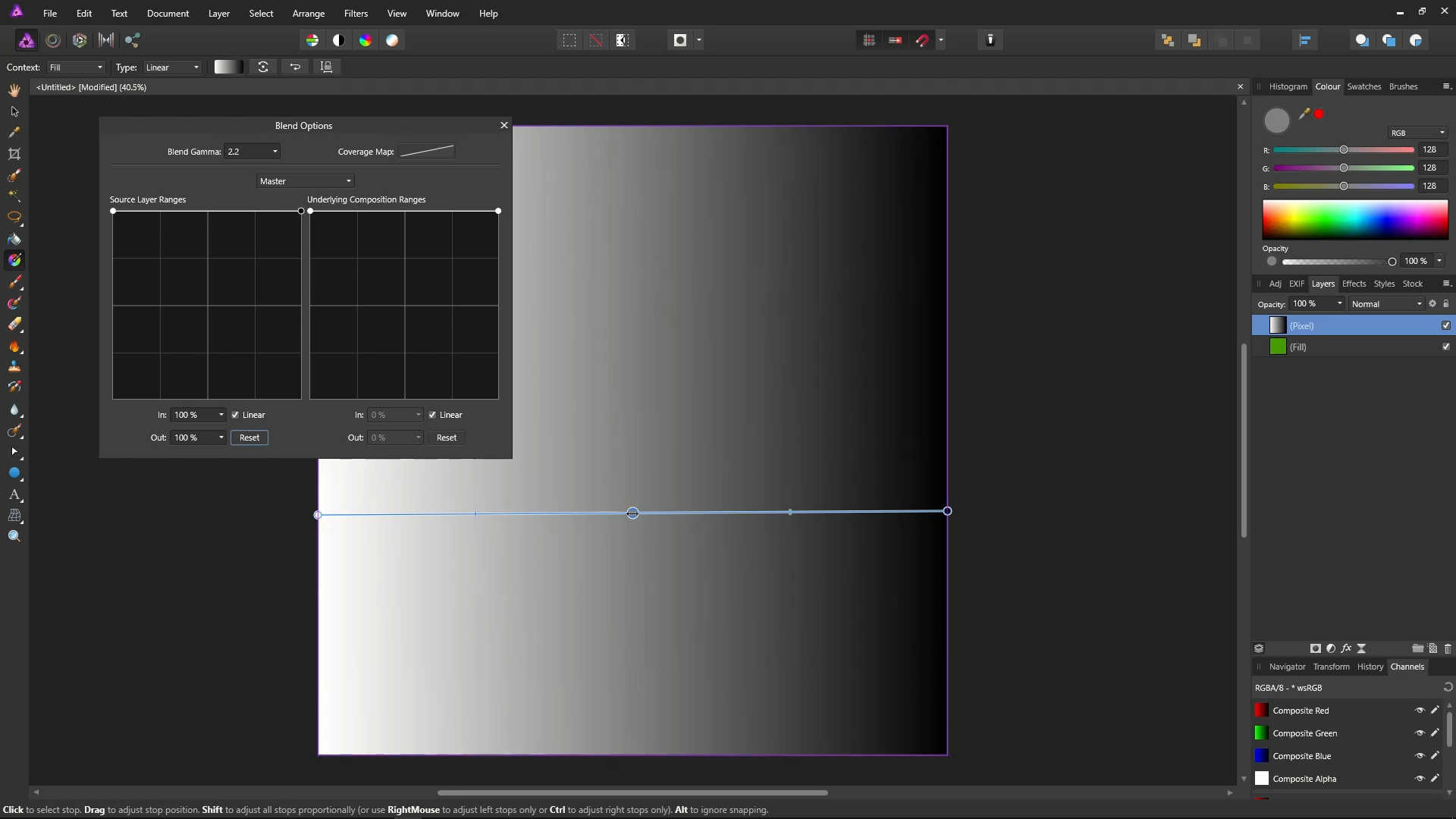
Click the Gradient icon from the tools.
![]()
Create a left-to-right gradient by dragging from the left to the right of the image.
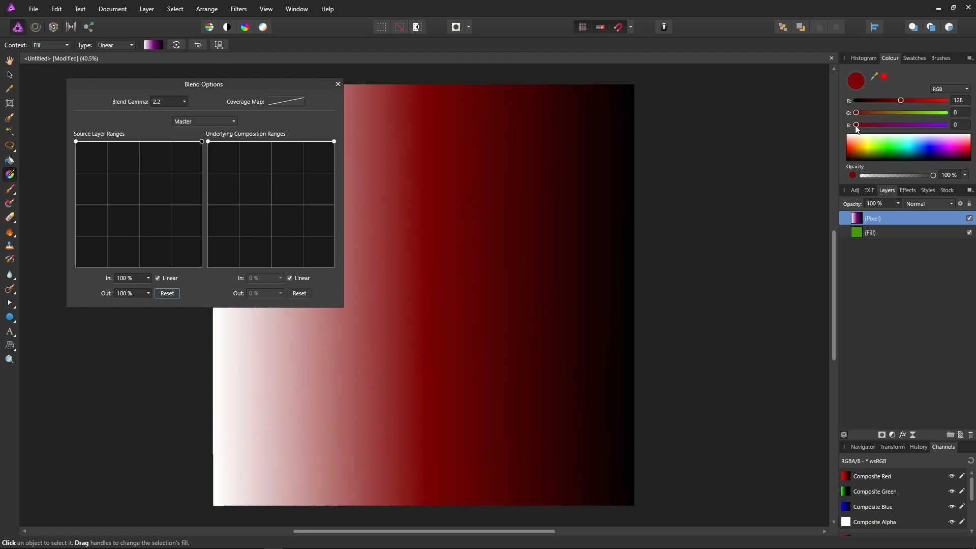
Click on the left point, and then choose pure white in the colour picker.
Click on the right point, and then choose pure black in the colour picker.
Create another point on the gradient, by right clicking in the center of the line.
While the point is still selected, set it to a medium red in the colour picker using the sliders. That's a value of 128 for red, and 0 for green and blue.
Move the Blend Options dialog back out of the way of the image, by dragging it with its title bar.
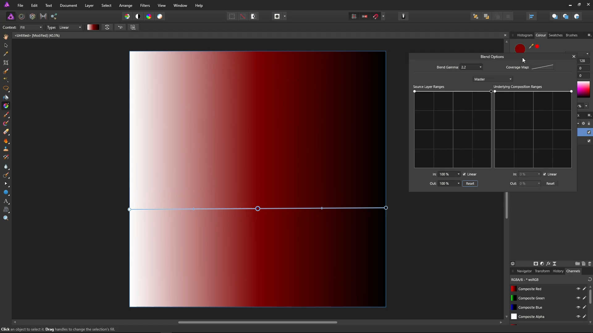
Click the Hand icon (View Tool) to get rid of the gradient line.
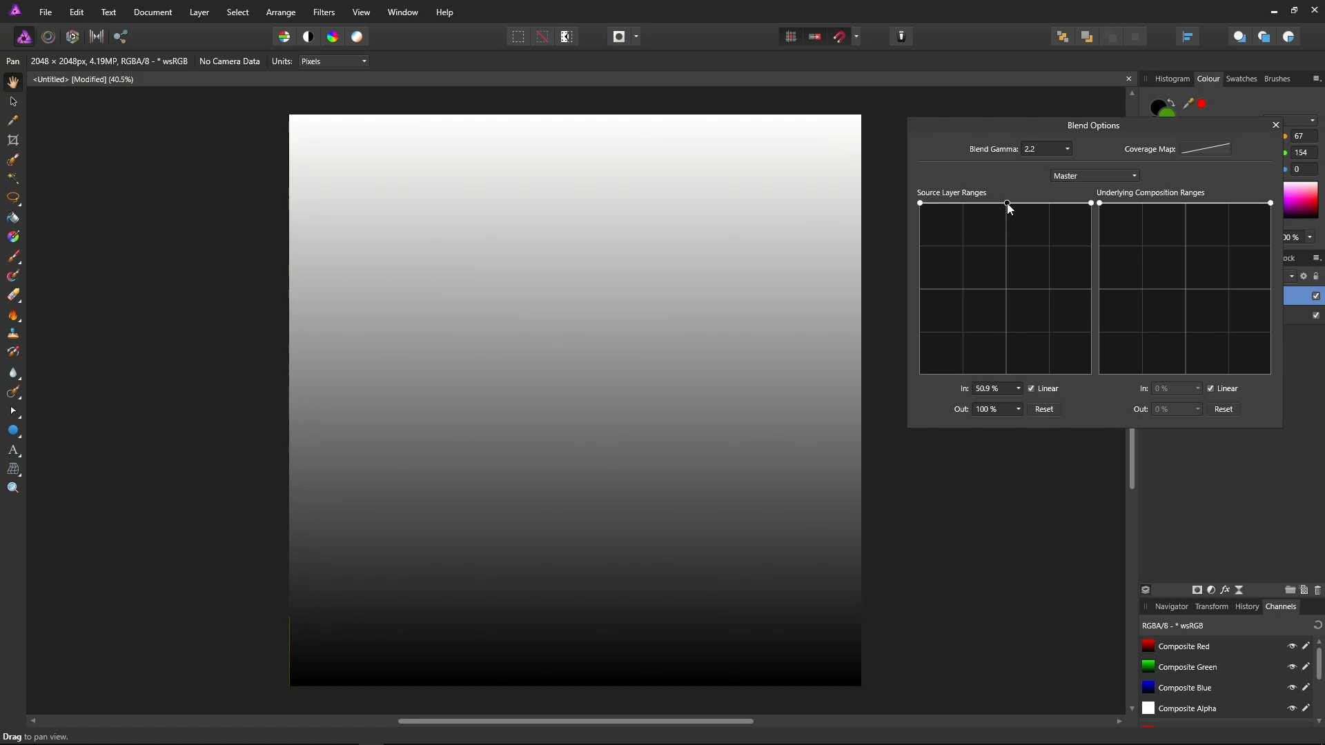
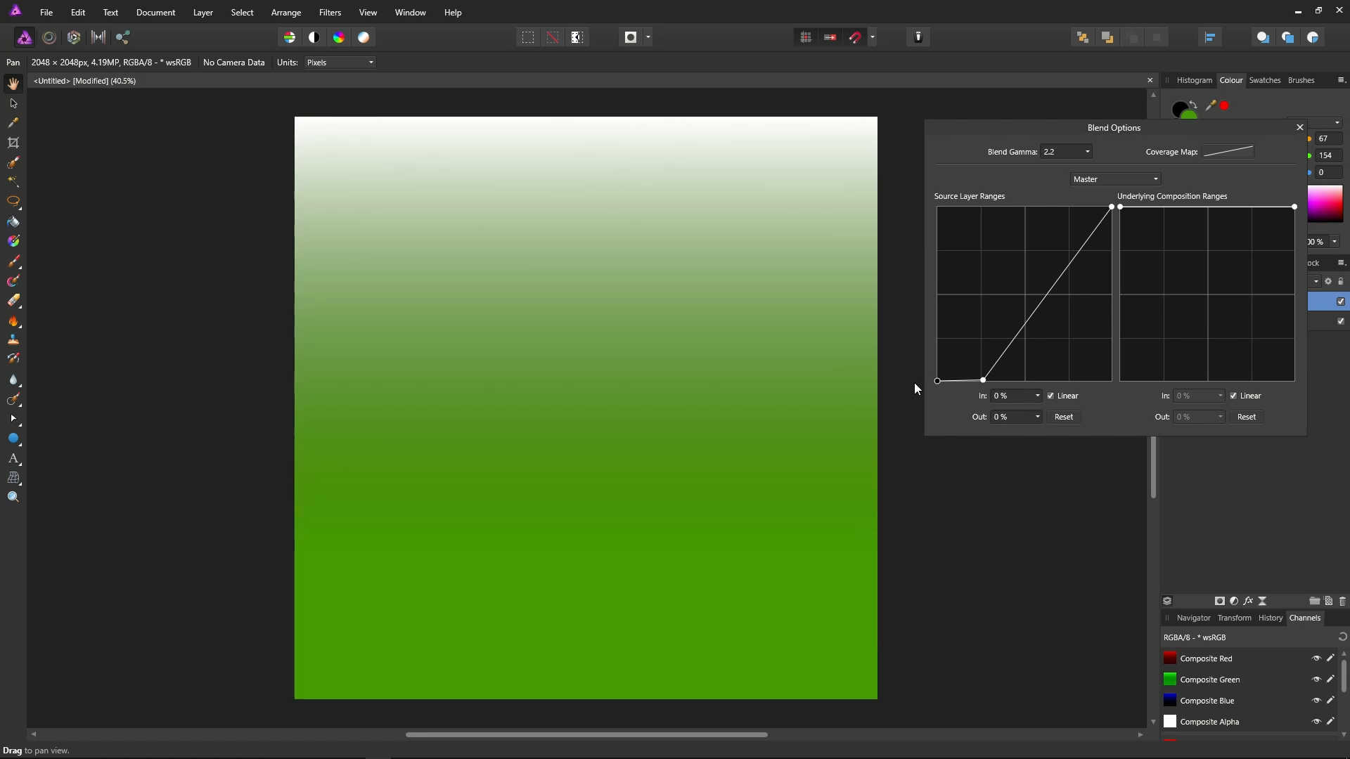
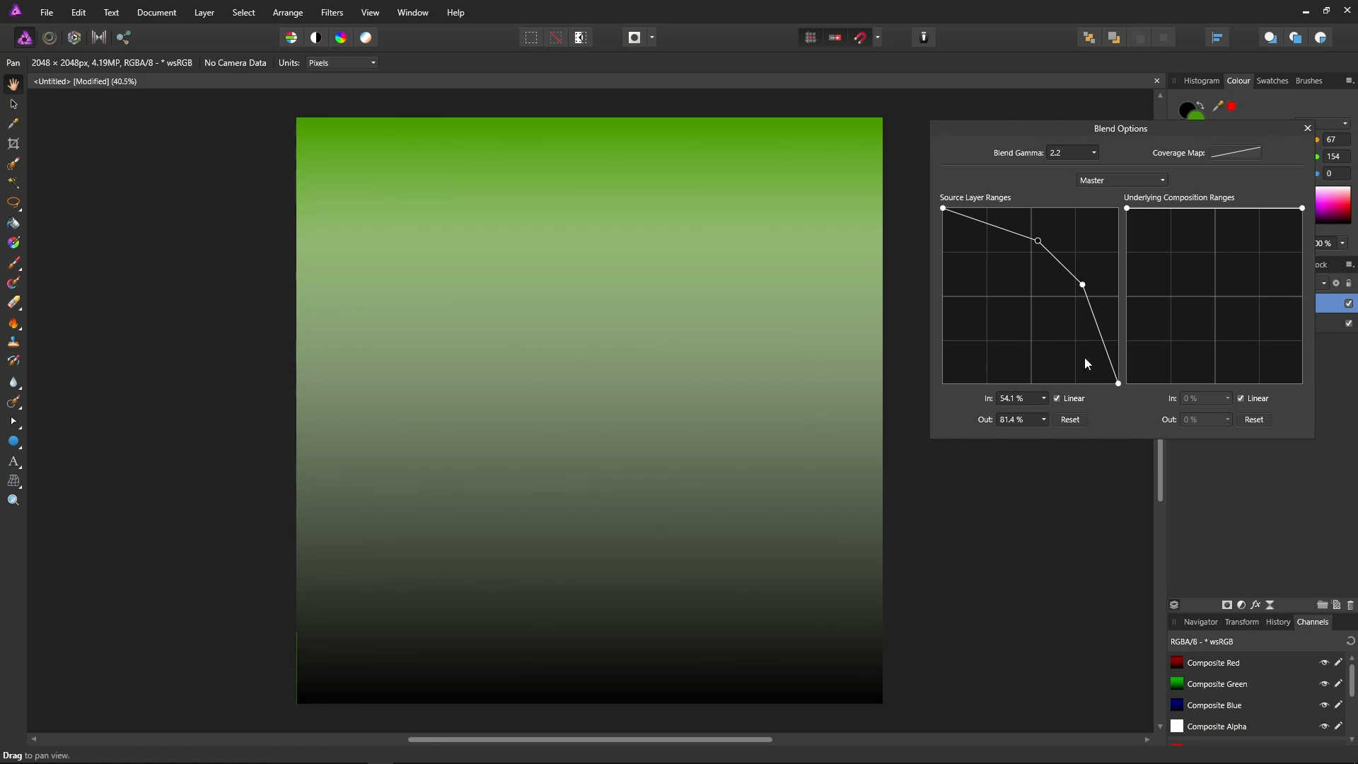
In the Blend Options dialog, bring the left point down to 0 on the Source Layer Ranges graph.
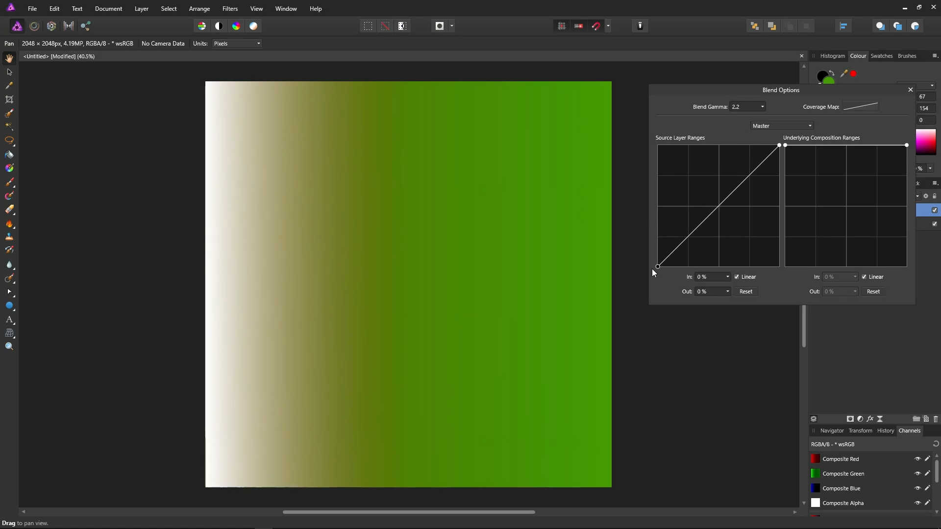
Now, black on the gradient layer is 0, which is completely transparent. So the green from the background layer shows through more in the darker area, and completely in the black.
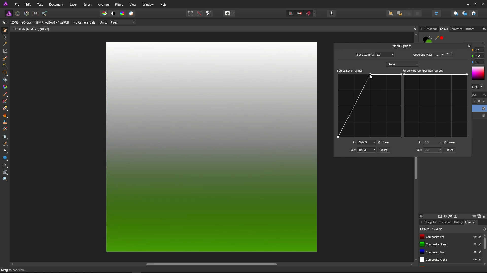
The white on the gradient layer is completely visible, so green shows through less in the brighter area, and not at all in the white.
We also have a nice effect where the red is mixing with the green from the background layer. This is because the blend ranges are based on luminosity (brightness).
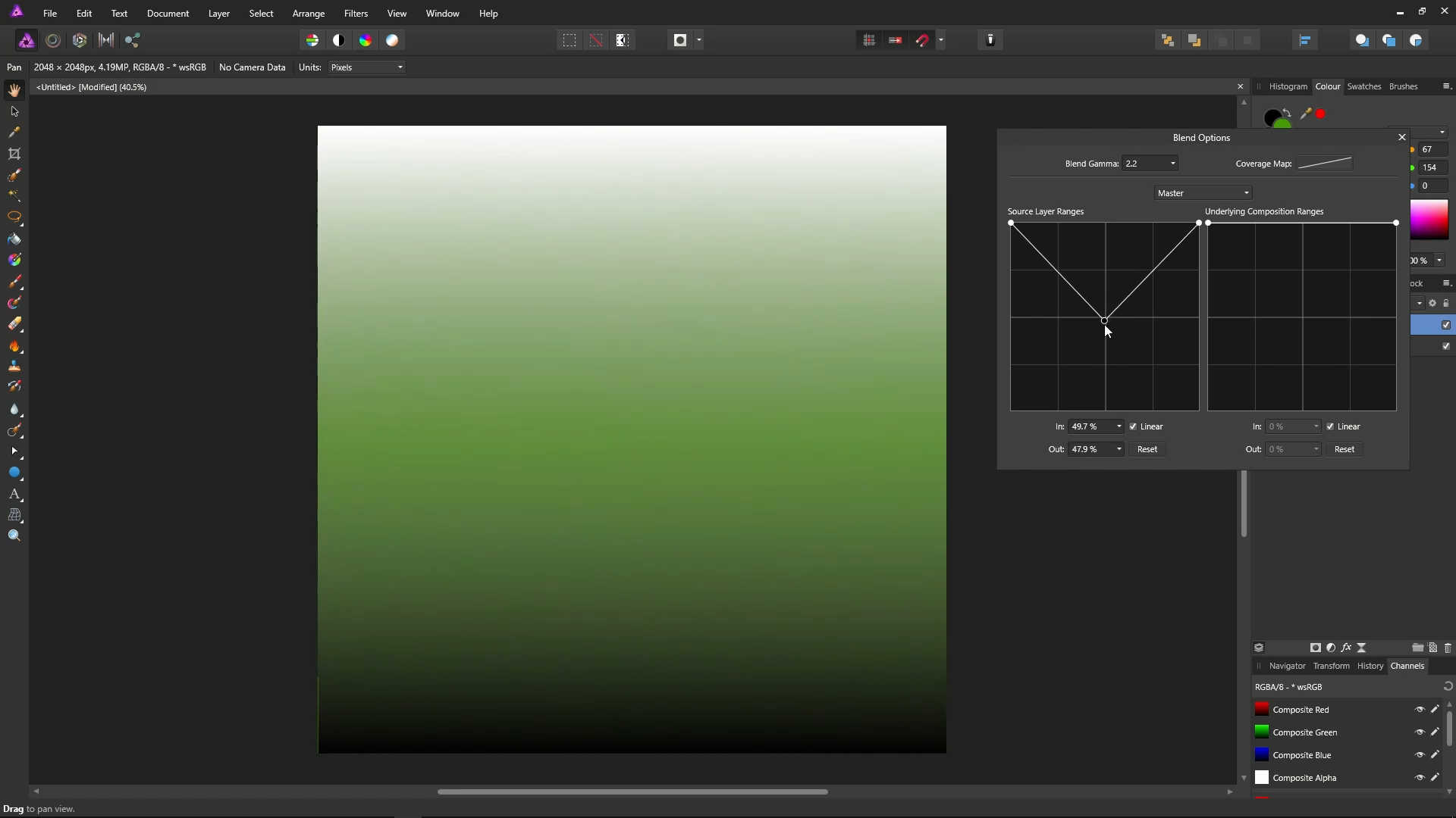
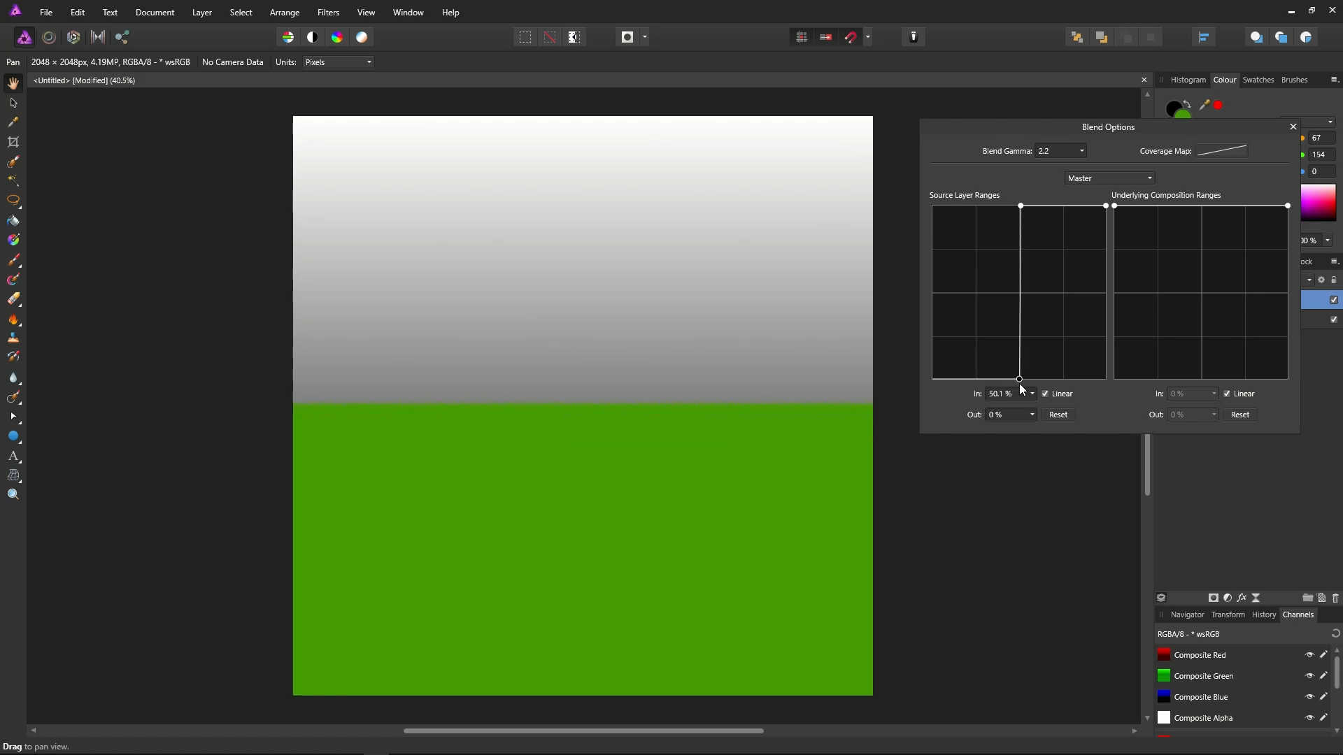
Bring the left (white) point all the way to the top, and the right (black) point all the way to the bottom.
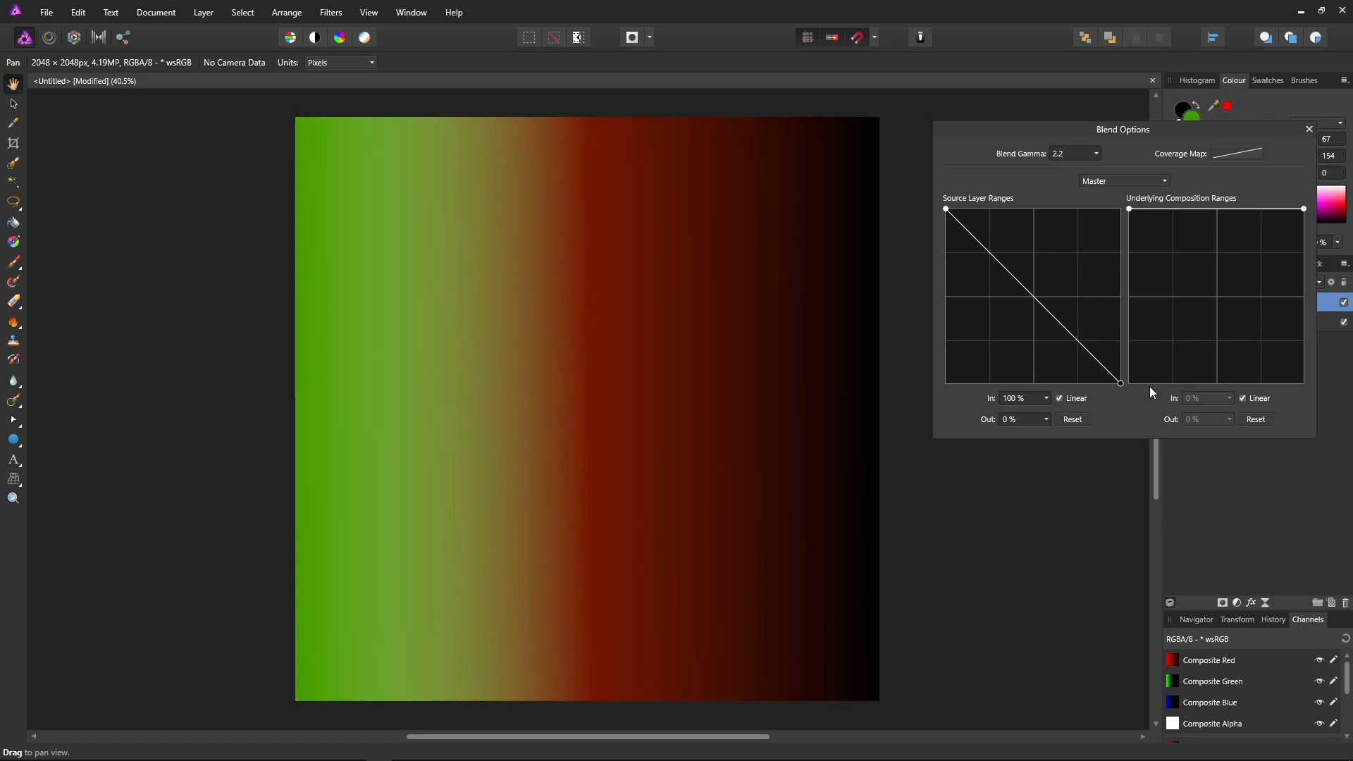
Now, black on the gradient layer is fully visible, meaning no green shows through where the gradient is pure black, and generally less green shows through in the darker area.
The white on the gradient layer is 0, completely transparent. So in pure white, the green shows through completely, and generally less green shows through in the brighter area.
In the middle of the gradient, the green from the background is mixed with the red from the gradient, with more green showing through in the darker red, and less green showing through in the brighter red.
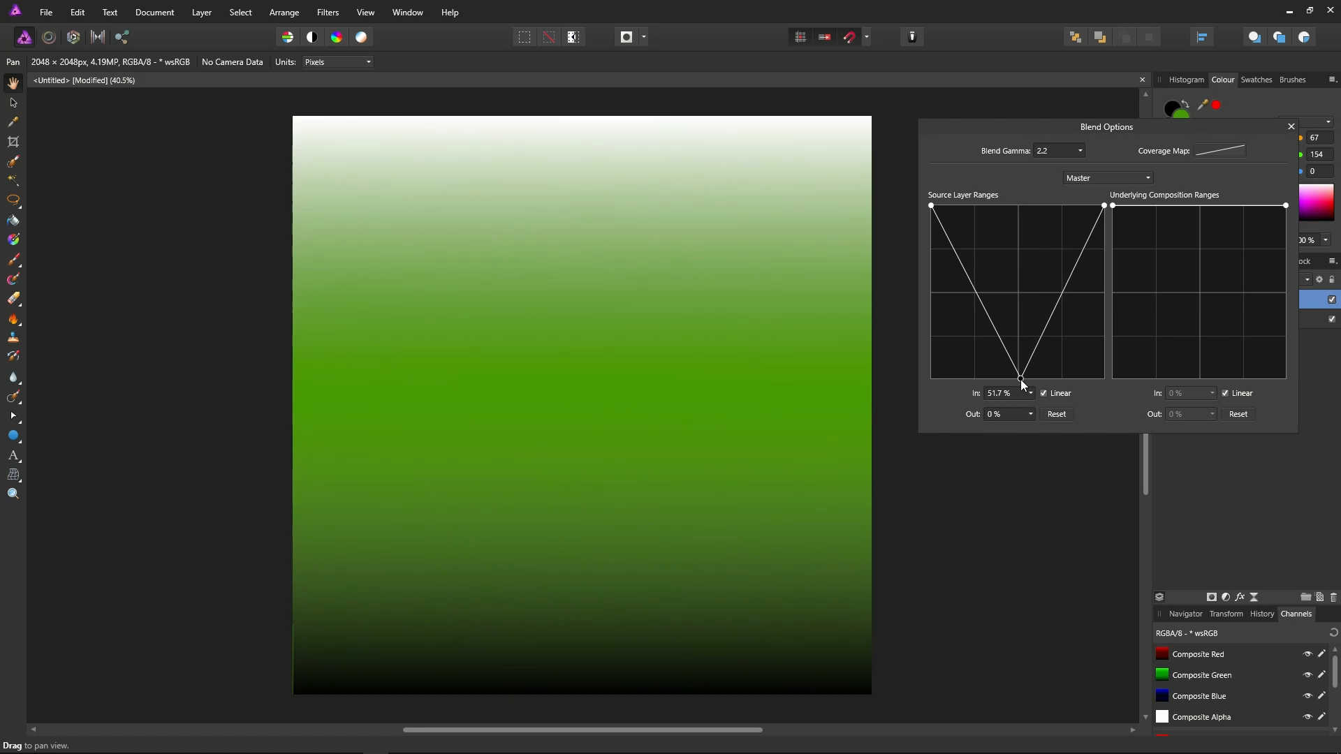
This should demonstrate that blend ranges aren't limited to black and white, as they are based on luminance (brightness) rather than colour.
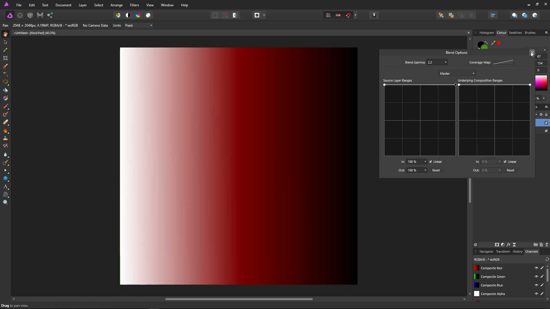
We're now going to take a look at some real-world examples with real photos. Close the blend ranges dialog with the X in its top-right hand corner.
Let's take a look at using blend ranges to brighten highlights on objects in a photo, such as flowers, clouds etc.
Open a photo. Click the adjustments icon, and select Brightness / Contrast
![]()